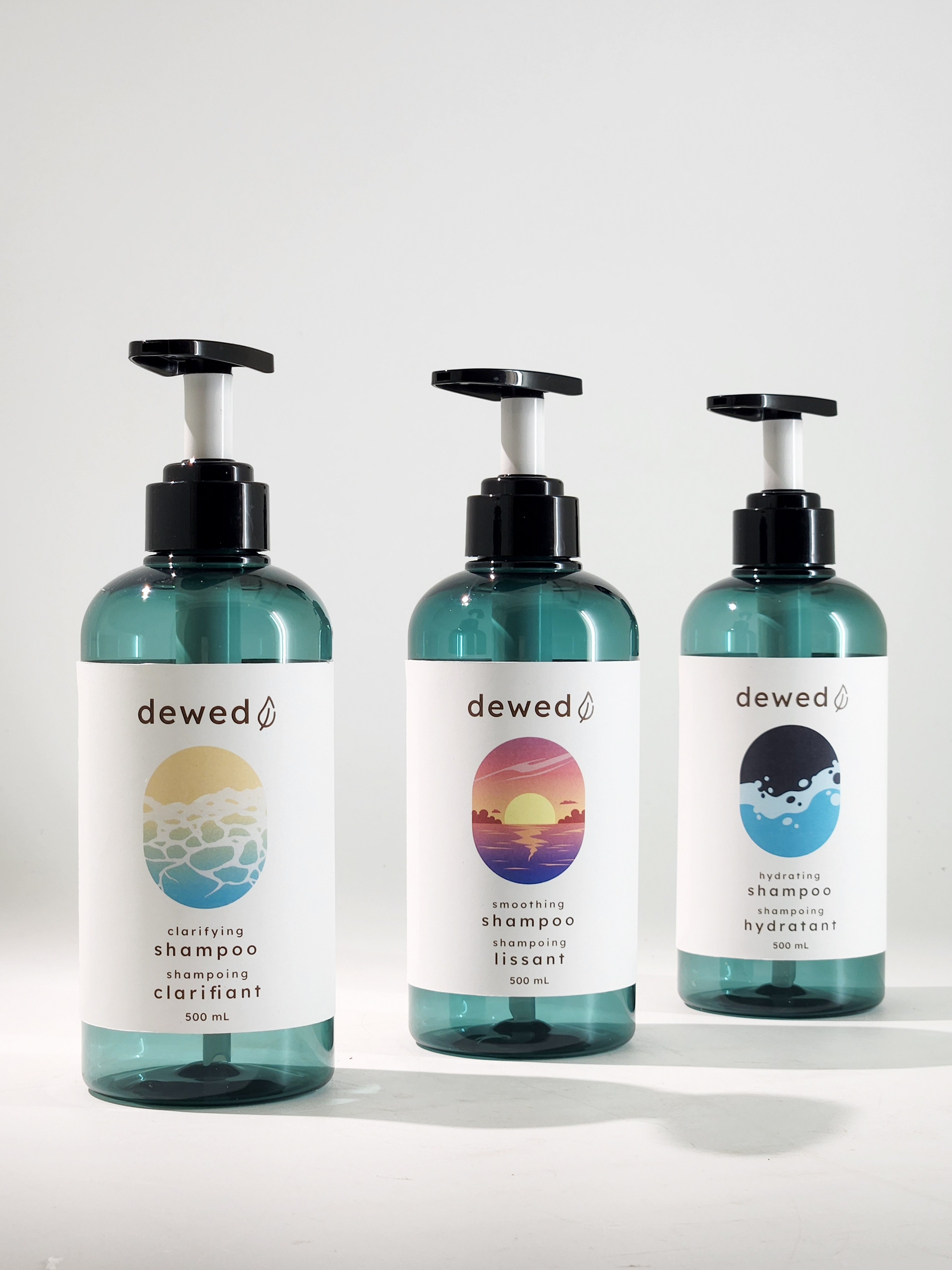
Dewed is a theoretical shampoo brand that aims to be accessible for those with dyslexia, colour blindness, or any physical disability. The brandmark uses a dyslexic-friendly font with increased tracking to improve readability. An icon of a leaf that also looks like a drop of water is included to visually communicate the idea of dew and freshness.
Prototype Photography
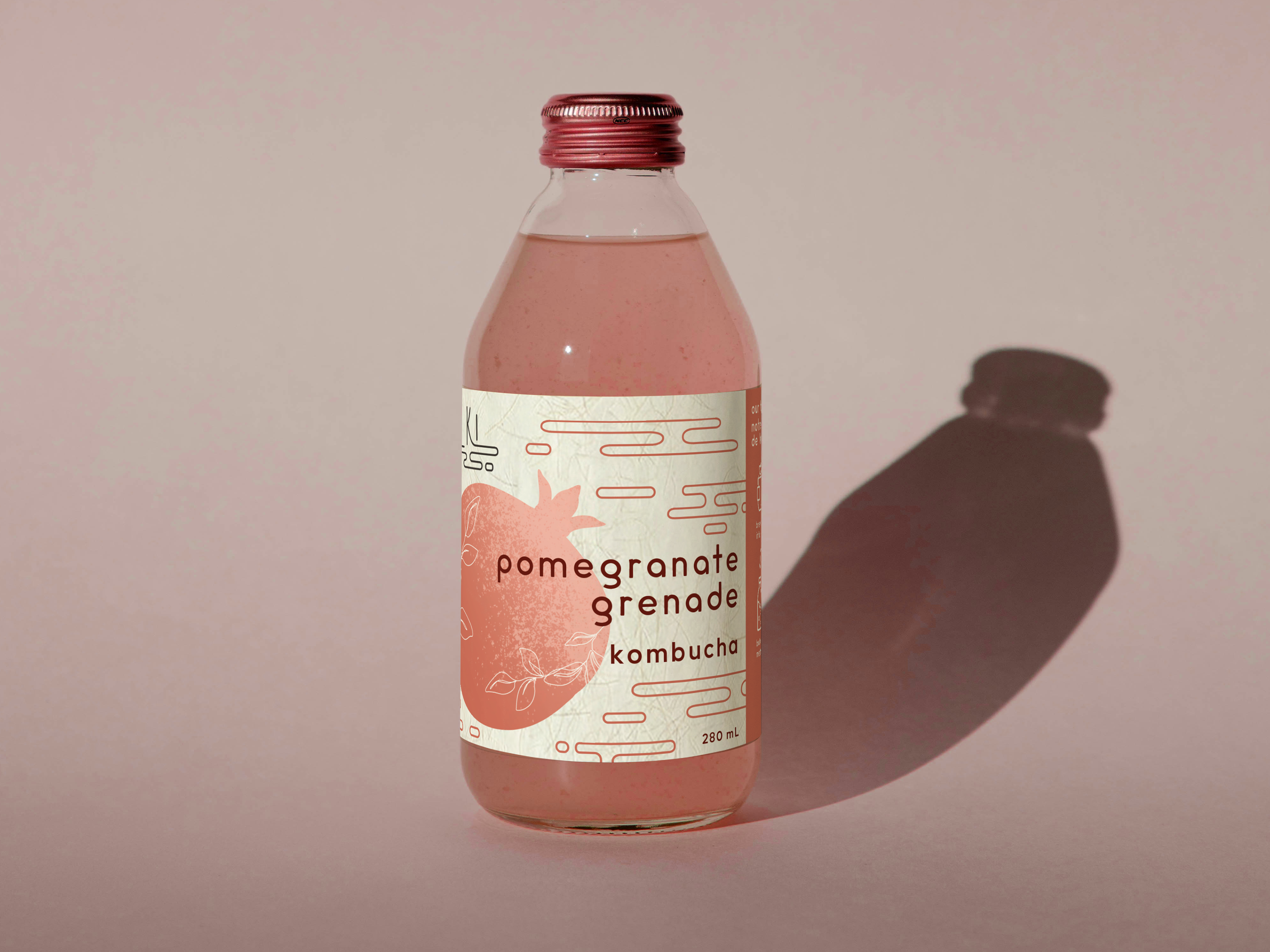
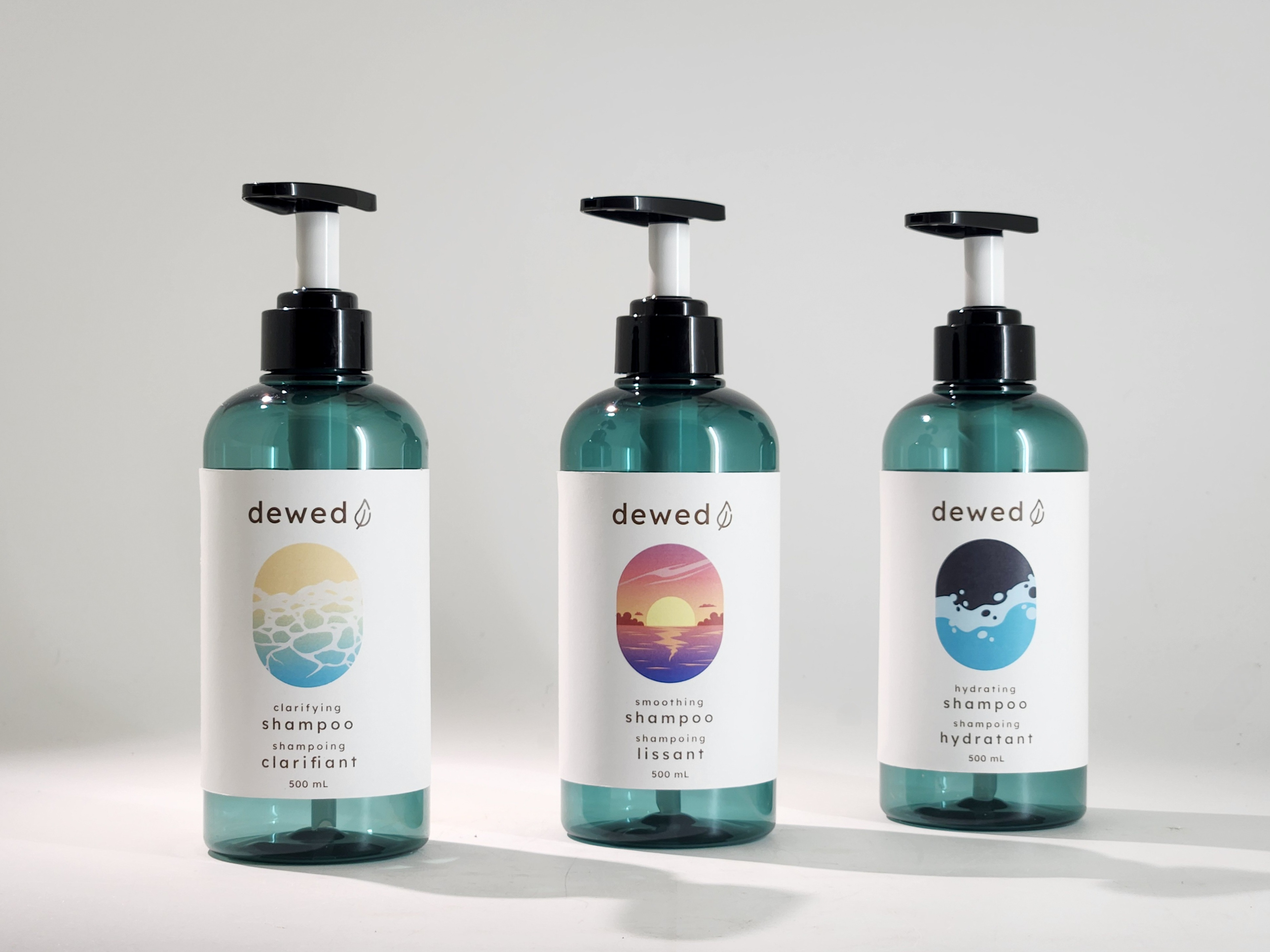
Ideally, the bottle would be matte to make it easier to grip for those with mobility and dexterity disabilities. However, I could not find the unique bottle colour in matte. The teal colour compliments the label design and contrasts against the white label, giving the product an upscale and trustworthy feel.
Further Real World Applications

Electronic Dieline

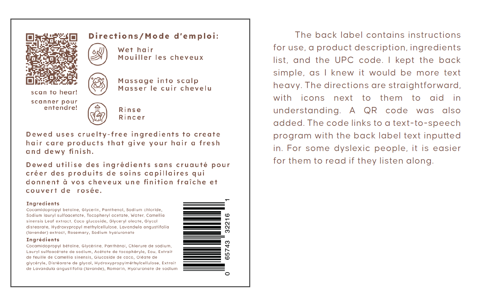
Back Label Design